Saturday, 27 March 2010

Elephants


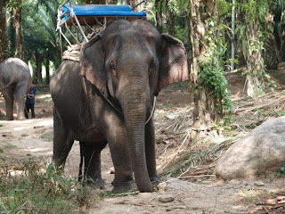
Original Image

Photo taken in Thailand

The story that would be associated with this image is about my favourite animal; elephants.
There is a lot more to this magnificent animal then meets the eye and i think they make for an interesting topic.


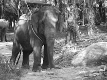
Edited Image.

I thought that a grey tone would suit this picture as elephants are usually a muddy grey tone.
I haven't cropped the picture as i think it all works very well together, especially the elephant walking away in the background.

To edit the picture, i changed the Hue to -100, Brightness to 28 and Contrast to 51
This is all on a scale of -100 to 100

I think the darker tones on the elephant make it stand out against the backdrop and accentuate its magnificent features.
The light grey and almost white tones of the background make it appear dry and forest like.
Elephants are obviously uncommon animals in England and so taking away its realistic colour and look, it makes it seem even further from real then it already is.

Storm Trooper

Original Image

Taken at the Movieum in London.

The story that would be connected to this picture is an article featuring a dedication to the flm. Being one of the most loved films ever made, it would certainly spark interest.


Edited image.

The image has been cropped but only to rid of unnecessary items in the background. The only other tool used for editing the image is the clone tool. I thought reproducing the storm troopers side by side would give it more of a dangerous and realistic feel. I edited them as closely together as possible, this way they look as if they are standing in line and they dont overlap each other. The fourth clone that is almost hidden has a patch around his head of red backdrop. I found i couldnt edit over this without overlapping the rest of the storm troopers.

Eagle, Hidden Beauty

Original Image

The story that associates itself with this image is 'hidden beauty'
It would cover how there are many beautiful things in the world, but we never really see them because are too busy to stop our overly important lives for one second, and have a look around. It would also detail the endangerment of the species, all the while basking in its proud glow, having no real words to describe the beauty of the animal.


Edited Image

I am very proud of this image and would happily publish it without any reconstruction. I did however, crop it a little to bring the eagle forward and rid of wasted background. I didn't want the picture to focus solely on the bird as the background helps to emphasise natural beauty with all its greenery. Cropping it to this size also means that the eagle is directly in the middle of the picture. I changed the hue from 0 to 8 on a -100 to 100 scale. This just gave the plants in the background a greener tinge, which emphasises the whole natural aspect. I cloned the leaves in the bottom right corner to make them stand out more. There is also leaves on the left of the eagle now as well. I brought the leaves as close as possible to the eagles chest as this to me was the best way of describing how natural beauty is all around with only the use of editing.

Wednesday, 17 March 2010

Photojournalism

Original Image
Article that would accompany this image is teenage pregnancy, right or wrong?

Edited Image
I cropped the image so that it would focus on the main part of the photo.
I used the wave paper effect to bring a very plain tone to the subject. The background i sponged to make the colour vivid and fun. The contrast between the subject and the background show the difference in teenage pregnancy, advantages and disadvantages.
There is a lot of controversy over this subject and one that needs to be spoken about. However, the education and society today focuses only on the negative issues of teenage pregnancies. The advantages should also be looked at, not to encourage young girls to fall pregnant but to relieve those that do of scrutiny and ridicule.

Thursday, 11 March 2010

My Photos, Size Zero


Original Image

The story that is combined with this picture is size zero and how we dont realise how much we are influenced, hence the mannequins.
These figures add to the problem and encourage people even more into believing that size zero is beautiful.
This apparent beauty has been contained into this box and it automatically makes you think that you cant enter into it. In other words, you arent good enough unless you're size zero.


Edited Image

After editing out all other forms of advertisement i added the words size zero only onto the sign next to the mannequins. This means that the attention is drawn only to this sign rather than looking at the shop signs. Editing that onto the board creates a boundary for any one that does not fall into the size zero cateogory. The poles and rope around them also adds to this point. The sign creates a mental barrier whereas the pole and ropes add to a more physical barrier.